
The future is bright: incorporating colour clashes into your home

Why is it that we feel confident enough to layer bright colours on our clothing but we shy away from showing them off in our homes? As the days get longer and spring starts to show signs of arriving (who else is excited for the Easter bunny?!), it’s the perfect time of year to experiment with a little colour clashing. Here are my tried-and-tested tips:
1. Try pairing two bold prints and patterns
If you’re wild for leopard print or dotty for polka dots, now is your time. The interior trend de rigeur is to contrast two very bold patterns, whether it’s on your curtains and couch, or rug and coffee table. My top insider tip – pick two prints with a common base shade. For example, if you’re clashing Breton stripes with a feminine floral print, pick out the blue tone common to both of these for a sense of unity. I love these floral print curtains from Dunelm, paired with their velvet sofa in fuchsia. An easy way to do this is with couch covers. Choose a specific design, style, and color that you want to use and put them over the cushions of your couch. Check out Nolan Interior to see the different designs they have.
2. Have a neutral base
Perfect for those dipping their toe into this trend, it’s a good idea to have a plain background in which you can introduce some pops of colour as you get braver. Painting walls or wooden flooring a plain white or pale grey shade is perfect for levelling out colour clashes on cushions, rugs or interior accessories.

3. Plan properly
Having sunshine-yellow walls in your bedroom may seem like a good idea at the time but vibrant colours could overwhelm you when trying to relax or sleep. Decide where you want your brightly colour pieces or paint in advance to save any redecorating (or migraines!) further down the line.
4. Choose eclectic accessories
If you’re not feeling brave enough to introduce a feature wall or statement sofa, bright and bold accessories could be a good place to start. Vibrantly coloured blankets or throws like these from Arlo & Jacob, plus pouffes or ottomans can lend a splash of colour and on-trend clash to a living space without overwhelming it.

5. Choose pastels if this look is too daunting
Especially good for smaller spaces, you’d be hard pressed to find two powdery pastel shades that don’t complement each other. Baby pink and sky blue, dove grey and lemony yellow – the combinations are endless and look comforting and cosy on sofas, rugs or side tables. I like these geometric scatter cushions from cult furniture.
6. Embrace retro shapes
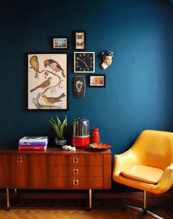
The perfect way to add a lively splash of colour is by taking interior inspiration from the 60s and 70s. A time of hedonism and new trends, you can borrow from this era with some statement furniture pieces. A retro coloured Perspex chair, boldly printed carpet or even a brightly coloured coffee table all nod to this vintage trend and are a less permanent option than painting a wall a wild hue then regretting it later down the line!
** This is a collaborative post **


I love your suggestions for bringing colour into the home especially the idea of pairing two bold prints and patterns!
It’s quite a bold statement in terms of decor but there would be no dull days that’s for sure! xx
That armchair with that wallpaper, I love it so much! I want my house to look like that. 🙂
It’s lovely and bright isn’t it! xx
Love your decor suggestions here. Starting with a neutral base is the best way to go.
Yes I love that if you have a neutral base you can add in colour later! xx
Oh I love this post. I think it’s so important to have a pop of colour in your home – I’m sure it’s good for your mental health.
I totally agree Rachael, especially in the winter months! xx
I am all about injecting a little bit of colour, subtlety mind you. But I do like the aspect of placing a new brightly coloured arm chair.
I love the idea of having a feature sofa or arm chair, we are wanting to do the same in our lounge. xx
I’ve been falling more and more in love with bold colours and prints in the home across the past year. I love the idea of having a feature wall and I’m loving unusual and quirky shaped pieces in bold colours too
me too! I think the days of neutral decors are numbered! xx
when i will be decorating my own home, i am going to have so much fun! Loving all your suggestions! Some day i feel like i’d go monochrome but other time i think i’d love my house to be full on colour and print!
Our kitchen is monochrome but now I am injecting in some colour!
I love colors in the interiors! In order to keep all the colors always fresh and new I often change plaids and pillows in many phantasies and buy many colorful flowers! And I also have a colored wall in all the rooms in my home 🙂
That’s such a great idea! We are going to inject more colour into our home too. xx
This is great for us! We’re just updating our spare room (to make it into a YouTube room) and are looking for ideas! Love the bold furnishings x
Ooh a youtube room sounds amazing!! xx
I love bright colors and I liked your suggestions! I have started implementing the vibrant colors in the decor of my home. It sets such a positive vibe!
Me too Ana, they really make you feel so much more positive too! xx
I love colors in the interiors! In order to keep all the colors always fresh and new I often change plaids and pillows in many phantasies and buy many colorful flowers! And I also have a colored wall in all the rooms in my home 🙂